Project Advantage
Develop a logo and branding for Project Advantage, a West Michigan based charity using soccer to teach life skills and values to disadvantaged children.
Football (soccer) is a sport I've played all of my life and through it I've learned so many things and made some wonderful relationships. When I heard about this charity, I wanted to be involved in helping get them off the ground because the cause is something I care about and believe deeply that the method will work.
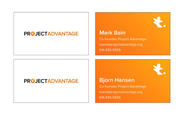
I helped them develop their branding, set up a website on Squarespace, get organizational email addresses using Google apps, and designed & printed business cards.
The typeface in the logotype is Proxima Nova Semibold, which is a sans-serif Grotesk. Sans-serif fonts are modern looking, which is befitting of a modern organization. Proxima Nova in particular has strong curves making it slightly more approachable and friendlier than a traditional sans-serif. The semi-bold weight gives it more visual impact than normal, while avoiding being too heavy.
The use of orange for advantage grounds the logomark inside of project and connects the two separate words, forming a cohesive whole.
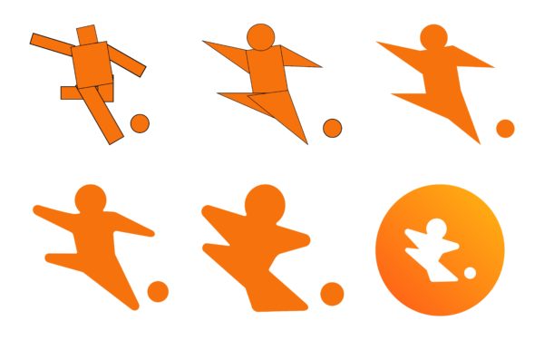
The logomark is a gradient-filled circle containing a silhouette of a child playing soccer. Orange was chosen because the color is viewed as friendly, cheerful, and confidant. The directional gradient from dark to light orange mimics the light from the sun and prevents the logo from feeling flat.
The exaggerated and rounded shape of a child ensures that the form is genderless and inclusive of all body types, to prevent people from feeling excluded. The playful form is also friendlier than a more athletic one and emphasizes a youth focus.
