Interactive Brokers
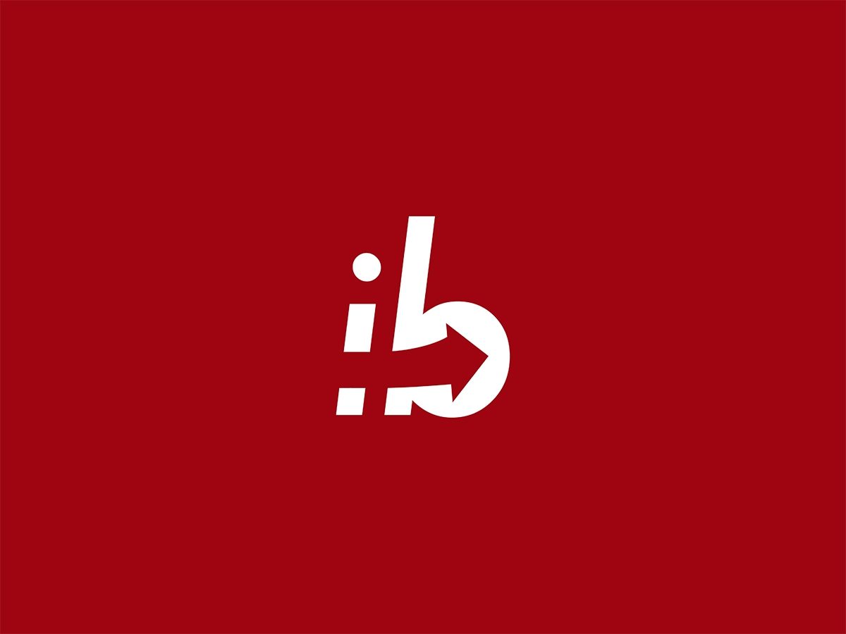
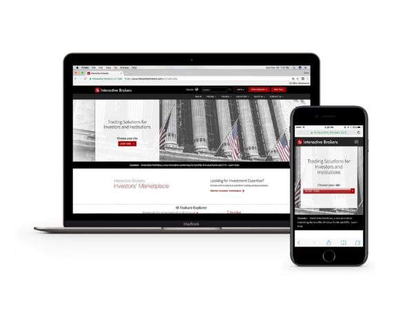
Concept redesign for the Interactive Brokers logo
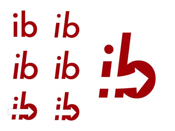
The goal of this design is to be modern and minimal, while maintaining easily recognizable branding. The signature color red remains, but darkened slightly for a richer, more timeless look.
The italicized type, combined with the left-to-right arrow, symbolize forward progress. The interaction of the arrow with the letterforms is a literal interpretation of the “interactive” half of the firm’s namesake. The subtle upward curvature of the arrow mimics that of a bullish breakout.
The darker shade of red is key to Interactive Brokers, helping it maintain its identity, and standout from other firms in the field trending increasingly green and neon with their branding.
Red is also a strong choice of color when considering the ever growing Asian market, where the color holds positive connotations related to good fortune and joy.


